Brand & Data
Visualization System
Overview
A research and professional services organization needed a unified branding and data visualization system to ensure consistency across all departments. Many teams produced content independently without centralized creative oversight, resulting in inconsistent reports, presentations, and published materials. I led the development of a comprehensive brand and data visualization framework that introduced alignment, accessibility, and governance across the entire organization.

The Challenge
Multiple teams outside of Marketing created materials without standard brand guidance.
Reports, charts, and presentations varied widely in style, weakening brand authority.
Departments lacked a centralized location for brand resources and visual rules.
Data visualizations were inconsistent and did not follow a unified structure.
The organization needed a scalable, easy-to-adopt system for 70+ employees.
The goal was to create a centerwide visual and operational standard that supported clarity, accuracy, and brand credibility across all published content.


Strategic Approach
I conducted an assessment of content produced across departments, identifying inconsistencies in typography, color usage, messaging, tone, and charting methodology. I partnered with internal stakeholders to understand workflow needs, technical limitations, and organizational priorities.
Key goals:
Establish a single source of truth for brand and visualization standards
Improve readability and accuracy of data visuals
Increase operational efficiency
Ensure accessibility for employees with varying design skill levels
Provide Marketing with oversight and governance.
Creative Solution
I developed a unified brand and data visualization system that standardized how the organization produced charts, presentations, and published materials. The solution focused on creating clear, accessible guidelines and implementing tools that ensured consistency, efficiency, and cross-center alignment.
Comprehensive Brand & Visualization Guide
Documented approved typography, color systems, chart formats, and messaging standards to create a single source of truth for all teams.Centralized SharePoint Access
Built an organized hub containing all templates and reference materials, ensuring easy adoption, version control, and consistent access across the organization.Standardized Charting Platform
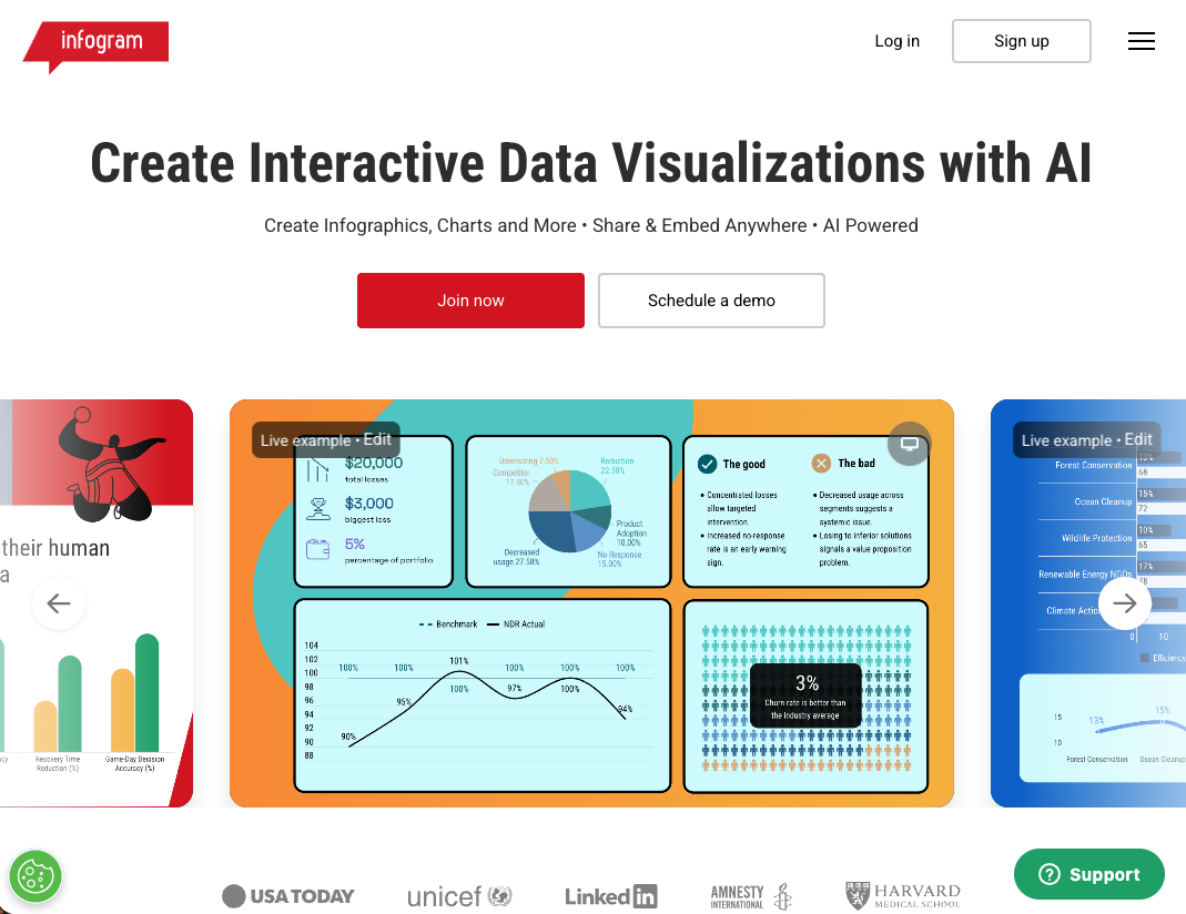
Implemented Infogram, a data visualization tool with branded templates and governance controls, to enable fast, accurate, and consistent data visualization for all departments.

Outcome
The new brand and visualization system delivered measurable improvements across the organization:
A unified, professional brand presence across all reports and communications
Accurate, standardized data visuals used consistently across departments
A dramatically faster content-production workflow
A single trusted source for all brand and visualization resources
Marketing regained visibility and governance over all charting outputs
More than 70 employees adopted the new tools and standards with ease
This initiative strengthened brand credibility and established a scalable creative operations framework for long-term organizational growth.